

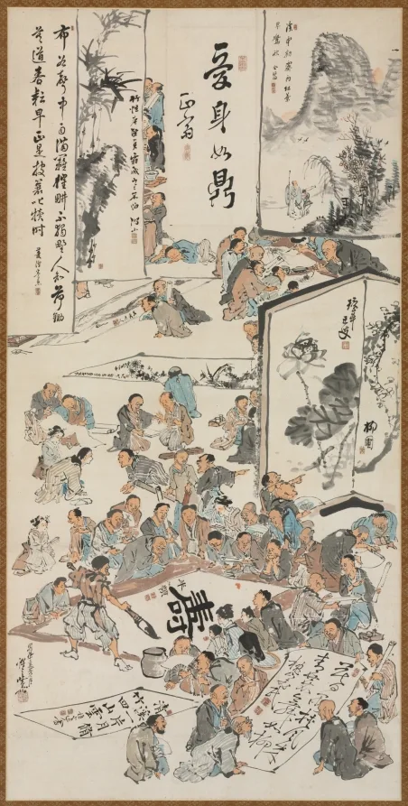
Japanese woodblock prints began circulating in Paris in the early 1860s, after treaties reopened trade with Japan. The usual story about prints arriving as wrapping paper around porcelain is probably too neat, but the price level it implies is right, because these sheets were cheap commercial goods in their own country. Shops selling oriental imports appeared in Paris within a few years. Painters were among the first regular customers.
What the prints offered was not exotic subject matter. It was a different set of solutions to problems European painters had been stuck on since perspective was codified. Where to put the horizon, how much of a figure to show, whether a colour needs shading to read as form. Japanese printmakers had answered all of these differently and consistently for two centuries.
The specific things that got copied
Four devices moved across almost immediately. A high viewpoint that tips the ground plane toward the viewer, a figure cut by the edge of the picture as if seen in passing, flat unmodelled colour bounded by contour, and large areas of empty ground used as active parts of the design. European painting had treated all four as errors. Once the prints made them look deliberate, painters used them without apology.
The results are easiest to see in printmaking and poster design, where flat colour was practical anyway. They are just as present in painting. Edgar Degas cropping a dancer at the frame, Mary Cassatt building an image out of pattern and outline, and the Nabis painters flattening an interior into decorative bands are all working from the same imported grammar.
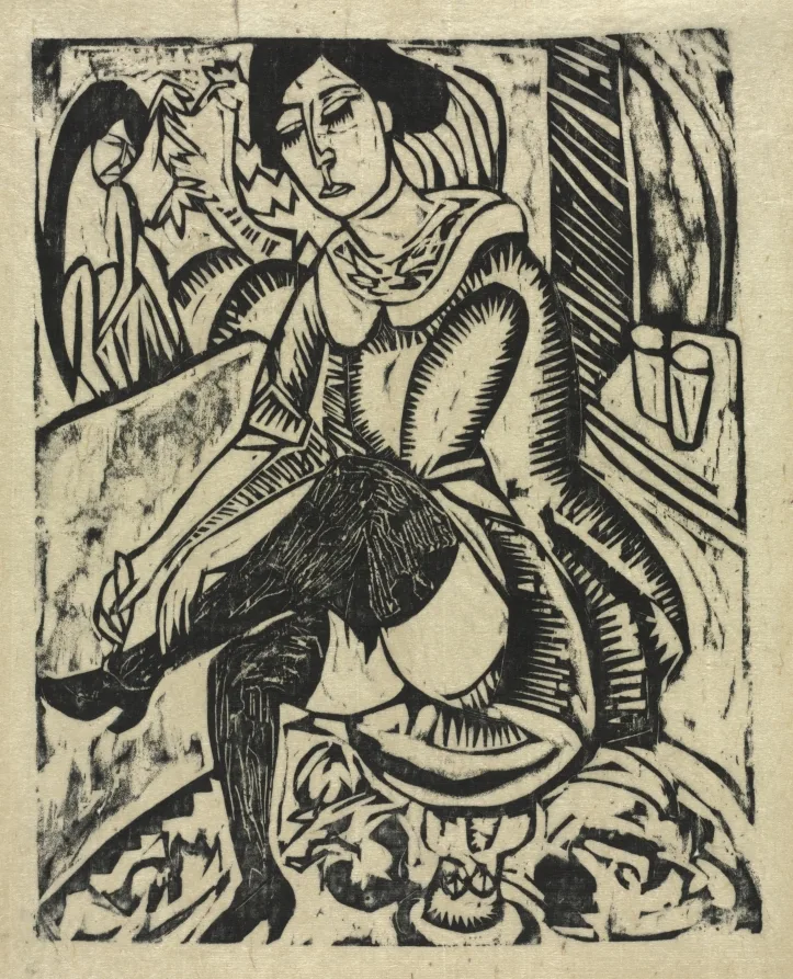
The trade organised itself quickly. Siegfried Bing imported and sold Japanese work and published the journal Le Japon Artistique between 1888 and 1891 in three languages, which gave collectors a reference and gave the field a vocabulary. Bing later opened the gallery that named Art Nouveau, and the two enterprises were connected in his mind and in his stockroom. A dealer who builds a category first is in a strong position when it matures.
- A large exhibition of Japanese prints in Paris in 1890 gave European artists a chance to study them in quantity
- Bing's journal ran from 1888 to 1891 and supplied the terminology collectors needed
- Vincent van Gogh painted his own versions after Hiroshige in 1887 as a way of learning the method
- Mary Cassatt made a set of colour prints in the early 1890s directly after studying Japanese examples
- Claude Monet assembled a large print collection that still hangs in his house at Giverny
- Prices in Europe rose steadily while the same sheets remained cheap ephemera in Japan for years
That price gap is the market story. A category can be worth almost nothing in the place that produced it and command real money a few thousand miles away, and the difference is entirely a matter of who is telling the story about it. Dealers moved sheets across that gap for decades. The value was created by classification, catalogues and journals rather than by any change in the object.
How to read the influence honestly
The label gets applied too widely. A European picture with a kimono in it is a picture with a kimono in it, and that is a subject choice rather than a structural debt. Real influence shows up in the bones of the composition, in where the artist put the horizon and how they cut the figure. Look at the design before you look at the props.
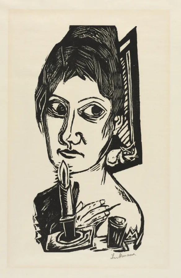
All my work is based to some extent on Japanese art.
Vincent van Gogh, letter to his brother Theo, 1888
The imports are still readable in almost any European picture made after 1880 once you know what to look for. Holdings of Japanese prints at the Rijksmuseum and at the Art Institute of Chicago make the comparison easy, since both institutions hold the European painting and the source material in the same building.
