

Ver Sacrum, the journal of the Vienna Secession, ran from 1898 until 1903. The name comes from a Roman rite in which a generation was dedicated to the gods and sent out to found something new, which tells you the tone the founders were after. Its practical job was simpler. The journal reached people who would never travel to Vienna and gave them the style in a form they could hold.
The format was the first argument. Ver Sacrum was close to square, an awkward shape for a printer and an expensive one, and the awkwardness was the point. A square page forces the designer to solve the layout rather than pour text into a familiar rectangle. Readers registered the difference before they read a word.
Original prints inside the covers
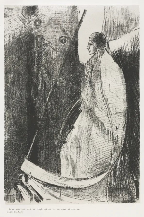
Issues carried original woodcuts, lithographs and drawings rather than photographic reproductions of paintings. That choice put the artist in direct contact with the reader, since the sheet in the magazine was a print pulled for that purpose. It also made the journal collectable from the first year. A magazine that people keep behaves like an edition rather than a periodical.
Typography, ornament and image were designed as one field. Text blocks were set to shapes that answered the illustration on the facing page, and border ornament was drawn for that issue instead of pulled from a printer's stock. Alfred Roller, Koloman Moser and Klimt all worked on the layouts. The result reads as a designed object rather than a container for content.
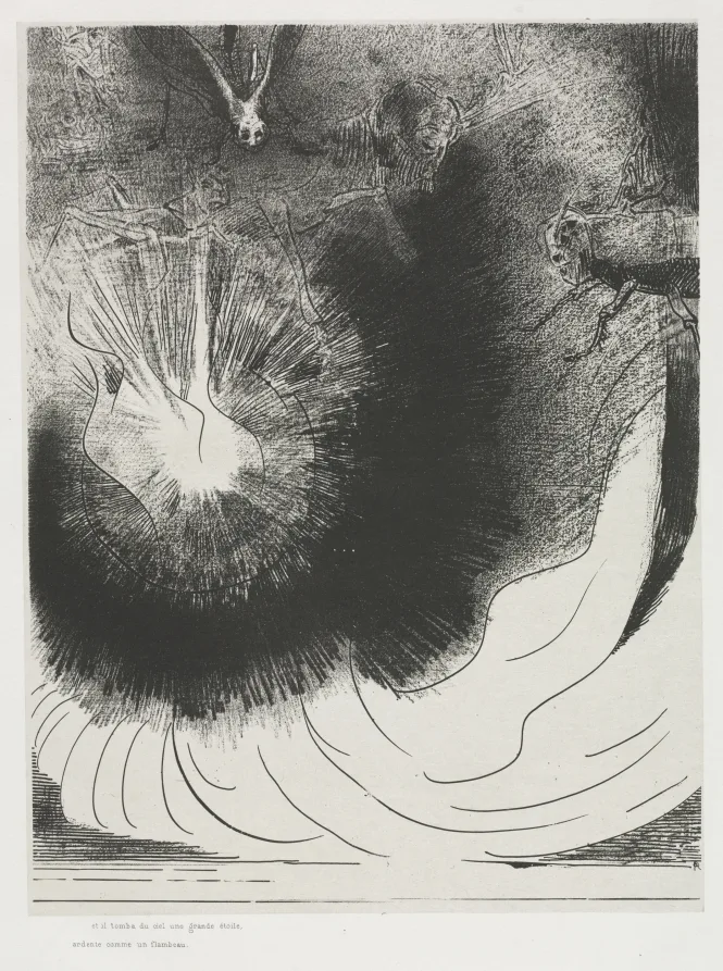
Print economics explain why so many groups of that decade started a journal. A painting sells once, to one buyer, in one city. An edition of a hundred lithographs sells a hundred times at a price a professional can afford, and each buyer becomes an unpaid agent for the style. Publishing turned artists into their own distributors for the first time since the age of the reproductive engraver.
- Subscribers paid in advance, which financed production before a single copy was sold
- Original prints bound into the issues made back numbers worth keeping and worth trading
- The square format gave the journal a shelf presence that ordinary magazines could not copy
- Designers treated type and ornament as part of the artwork rather than as packaging
- Foreign readers could follow the group without attending a single exhibition in Vienna
- Advertising pages were designed by the same hands as the articles, so the whole issue read as one object
- Back issues circulated through libraries and design schools long after the run had ended
Circulation for a journal like this was never large, and that was not the measure that mattered. What mattered was who read it. Architects, printers, teachers and shop owners took the vocabulary from the page and put it into buildings, posters and window displays across central Europe. One issue in a provincial design school did more work than a room full of paintings in Vienna.
What survives and what it costs
Complete runs of Ver Sacrum are rare, because issues were broken up for the prints inside them almost immediately. Single sheets circulate steadily and cost far less than a comparable drawing by the same artist. Condition drives most of the price spread, since the paper was good but the bindings were not. Trimmed margins and foxing take more off the value than most buyers expect.
A magazine is the cheapest gallery an artist will ever run, and the only one that reaches a reader who cannot afford the train fare.
Beautiful Art editorial note
If you collect the printed side of this period, buy the whole issue rather than the loose plate whenever the price gap allows it. An intact copy carries the layout, the typography and the ornament that made the project matter, and it is far harder to replace. Print rooms at the Museum of Modern Art hold comparable material for reference.
